Finally, in this R post I use the prepared HESA financial data to reproduce, and analyse, the 2020-21 “surplus/deficit for the year” figures for the top five Scottish universities.
Introduction
Having imported and inspected the data in the first post, and wrangled it into a form suitable for analysis in the second, it’s time to actually do something with the data.
The analysis in this post has two main parts. Initially I’ll reproduce the “surplus/deficit for the year” figures for 2020–21 for the five universities. This, though, highlights a challenge: how do we compare the surplus/deficit figures of universities which may be vastly different in scale? In 2020-21, for example, the University of Edinburgh had around 2.7 times the number of undergraduate students as the University of St. Andrews, and this was reflected in income from fees.
This isn’t a question I can properly address in this blog (I’m also not a higher education finance professional, which doesn’t help). To make a comparison possible, though, I normalise the financial statistics for the universities by dividing the surplus/deficit of each university for the year by its total income. This is similar to the “net profit margin”, or net profit percentage, metric used to compare companies and provide some indication of their “financial health”.
There are some issues with using this kind of metric here. A major one is that is that universities are charities, not companies. The denominator for net profit percentage (NPP) is “revenue”, but what should this mean for universities? To approximate this, I’ll count as “income” the usual, operating, income received by Universities (e.g. from fees, and research funding) plus any additional net gain/loss from other activities used to calculate the surplus/deficit for the year (e.g. gain/loss on investments). These are the activities in the categories I grouped as “Other” at the end of the second post.
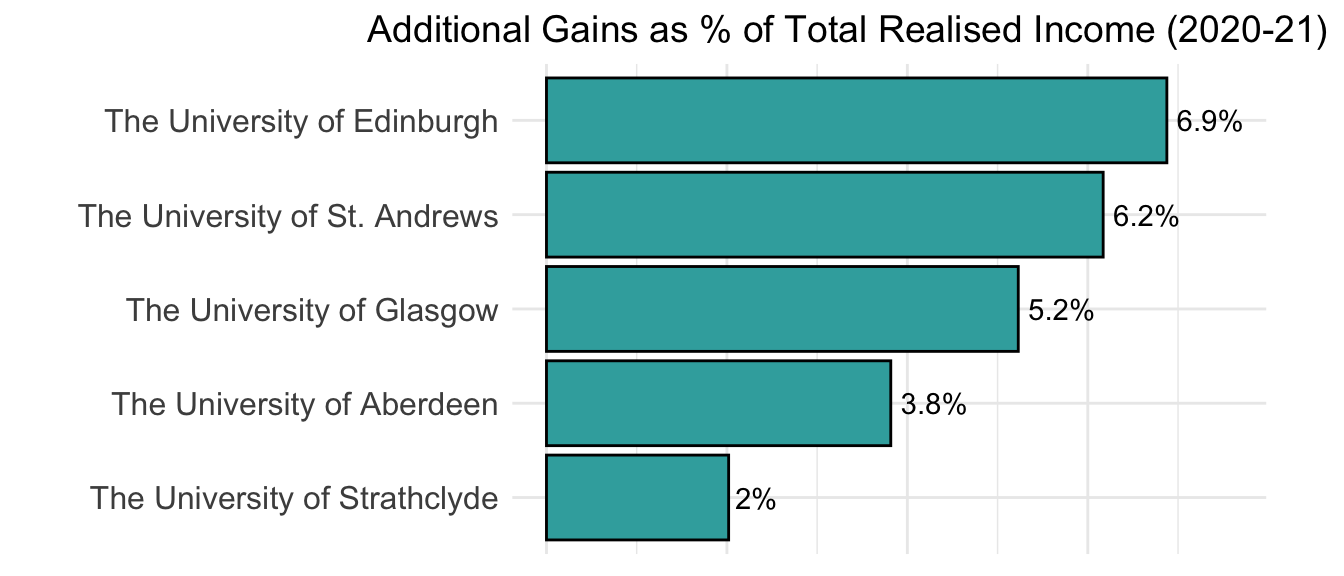
Combining usual, operating, income with net “Other” income may not reflect “standard practice” for analysing university finances. As I’ll show, though, some universities receive substantial income from these additional activities (e.g. this approached 7% of total income, understood this way, for University of Edinburgh in the 2020-21 academic year).
A related issue with this approach is that universities don’t have the profit-making goals of companies. Universities usually aim to have a surplus at the end of a year, as this can be used for investment purposes (e.g. in new services or facilities), but a deficit in a particular year isn’t necessarily a bad thing.1 Similarly, a low or zero (if there is a deficit) NPP for a university in a particular year isn’t necessarily a bad thing.
I don’t attempt to cash out (no pun intended) the analysis below in the form of a discussion of university finance in this blog. My main interest is in the data, and in manipulating and analysing it with R. Writing this blog, though, has left me with lots of questions, and I realise I’ve dipped my toes into a large, mostly unfamiliar, discipline with its own language.
Analysis
Preliminaries
I’ll start by importing the same packages as before. I’m also using ggplot2 this time, loaded as one of the tidyverse packages, and have set the theme for all plots in this post with the theme_set() function:
library(tidyverse) # import most of the packages needed
library(kableExtra) # for HTML tables
library(here) # to find absolute path to dataset
theme_set(theme_minimal()) # set ggplot theme
My starting point is the data frame uniFinData from the second blog, which (after importing and manipulating the dataset again in the background) looks like this for University of Aberdeen:
| University | Category | Subcategory | Value000s |
|---|---|---|---|
| The University of Aberdeen | Income | Donations and endowments | 236 |
| The University of Aberdeen | Income | Funding body grants | 87577 |
| The University of Aberdeen | Income | Investment income | 2012 |
| The University of Aberdeen | Income | Other income | 25764 |
| The University of Aberdeen | Income | Research grants and contracts | 45927 |
| The University of Aberdeen | Income | Tuition fees and education contracts | 74423 |
| The University of Aberdeen | Expenditure | Depreciation and amortisation | -16855 |
| The University of Aberdeen | Expenditure | Interest and other finance costs | -5840 |
| The University of Aberdeen | Expenditure | Other operating expenses | -59306 |
| The University of Aberdeen | Expenditure | Restructuring costs | 0 |
| The University of Aberdeen | Expenditure | Staff costs | -146956 |
| The University of Aberdeen | Other | Gain/(loss) on disposal of tangible assets | 4493 |
| The University of Aberdeen | Other | Gain/(loss) on investment property | 0 |
| The University of Aberdeen | Other | Gain/(loss) on investments | 5780 |
| The University of Aberdeen | Other | Share of operating surplus/(deficit) in associate(s) | 0 |
| The University of Aberdeen | Other | Share of operating surplus/(deficit) in joint venture(s) | -912 |
| The University of Aberdeen | Other | Taxation | 0 |
Methodology
As stated above, my goal is to calculate the net profit percentage (NPP) of the universities, by dividing any surplus by total income. So as not to over-complicate things in this analysis, if a university has a deficit for the year I’ll say that the NPP is zero for that university. For the purposes of the calculation, I’ll treat the following groups as income:
-
Normal, operating, income - i.e. that fall under the “Income” category for HESA:
- “Tuition fees and education contracts”
- “Funding body grants”
- “Research grants and contracts”
- “Other income”
- “Investment income”
- “Donations and endowments”
-
Any additional gains contributing to the surplus/deficit, i.e. within my “Other” category, from:
- “Gain/(loss) on disposal of tangible assets”
- “Gain/(loss) on investment property”
- “Gain/(loss) on investments”
- “Share of operating surplus/(deficit) in associate(s)”
- “Share of operating surplus/(deficit) in joint venture(s)”
I’ll call this total “total realised income”, to distinguish it from the term “total income” used by HESA (where it only refers to operating income). As regards my use of the term “realised”, the “surplus/deficit for the year” statistic is a measure of realised income/loss, i.e. of financial gains/losses that have been “locked in” by a university within a particular academic year.2
The importance of this second, “Other”, group for universities can be visualised by calculating total gain/loss across this group as a percentage of total income (across both groups). To do this, I’ll initially create OtherGLProp, including a column with this calculation as a proportion.
Step 1 here is to calculate operating income (currently under “Income”) and additional income/loss (currently under “Other”) for each University:
OtherGLProp <- uniFinData %>%
  filter(Category %in% c("Income", "Other"),
         Subcategory != "Taxation") %>% # drop the "Taxation" rows
  group_by(University, Category) %>%
  summarise(Income000s = sum(Value000s))

# display
OtherGLProp
## # A tibble: 10 × 3
## # Groups:   University [5]
##    University                    Category Income000s
##    <chr>                         <fct>         <dbl>
##  1 The University of Aberdeen    Income       235939
##  2 The University of Aberdeen    Other          9361
##  3 The University of Edinburgh   Income      1187406
##  4 The University of Edinburgh   Other         87677
##  5 The University of Glasgow     Income       813077
##  6 The University of Glasgow     Other         44864
##  7 The University of St. Andrews Income       290378
##  8 The University of St. Andrews Other         19095
##  9 The University of Strathclyde Income       347396
## 10 The University of Strathclyde Other          7159
One thing to note from this is that all universities made a net gain from “Other” activities. Another thing to note, though, is that the data is not in a “tidy” format: the variables “Income” and “Other” are both in the Category column, and the goal is to perform a calculation involving both. The names are also potentially confusing, as “Income” only refers to operating income here. These issues can be addressed by using pivot_wider, and doing some renaming, prior to the calculation, as Step 2:
OtherGLProp <- OtherGLProp %>%
  # pivoting into wider, "tidy", format
  pivot_wider(names_from = "Category", values_from = Income000s) %>%
  # renaming for clarity
  rename(OperatInc = Income, OtherGL = Other) %>%
  # calculating the proportion
  mutate(Prop = OtherGL/(OperatInc+OtherGL))

# displaying the result
OtherGLProp
## # A tibble: 5 × 4
## # Groups:   University [5]
##   University                    OperatInc OtherGL   Prop
##   <chr>                             <dbl>   <dbl>  <dbl>
## 1 The University of Aberdeen       235939    9361 0.0382
## 2 The University of Edinburgh     1187406   87677 0.0688
## 3 The University of Glasgow        813077   44864 0.0523
## 4 The University of St. Andrews    290378   19095 0.0617
## 5 The University of Strathclyde    347396    7159 0.0202
Pivoting was useful here as it enabled the calculation to be conducted as a row-wise operation, one of the virtues of “tidy” data.
Visualising Prop as a horizontal bar chart (and converting the proportions to a percentage, for labelling purposes) helps to demonstrate the results:
OtherGLProp %>%
  ggplot(aes(x = fct_reorder(University, Prop), y = Prop)) +
    geom_col(width=0.9, colour="black", fill="#39ACAC") +
    labs(title = "Additional Gains as % of Total Realised Income (2020-21)")+
    # add labels, convert to percentage
    geom_text(aes(label=paste(100*round(Prop, 3),"%",sep="")), hjust=-0.15) +
    ylim(0, 0.076) + # prevent cropping of column labels
    theme(axis.text = element_text(size = 12),
          plot.title = element_text(size=14, hjust = 0.7),
          axis.text.x = element_blank(),
          axis.title.y = element_blank(),
          axis.title.x = element_blank(),
          legend.position = "none",
          aspect.ratio = 1.3/2) +
  coord_flip()

The percentage of income attributable to “other” sources clearly varies between the universities, but is significant and highest for the University of Edinburgh (6.9%).
(For neatness, I’ll hide the ggplot code blocks from now on as the remaining plots are similar.)
Surplus/deficit for the year
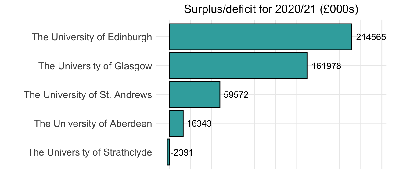
Using the uniFinData data frame created earlier, it’s straightforward to recreate the annual surplus/deficit values for the five universities: this is just the sum of all the values in the Value000s column, after grouping by university. The results can be seen here, in a bar chart:3

It can be seen that University of Edinburgh has the highest surplus, and University of Strathclyde was in deficit for academic year 2020-21.
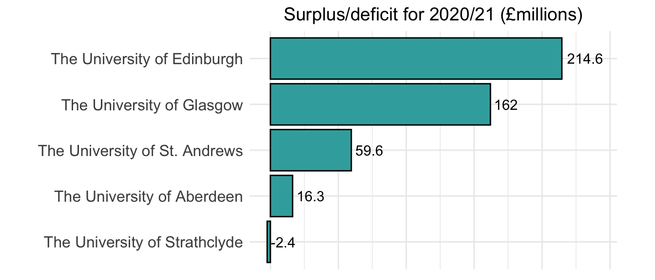
If, like me, you find adding three zeros onto numbers a bit unintuitive, this can also be represented in millions (by dividing the label values in geom_text by 1000 and rounding):

Net profit percentage for the year
An obvious issue with this analysis is that it’s difficult to compare the surplus/deficits of universities which are vastly different in scale. As noted earlier, University of Edinburgh has a much larger student population than smaller universities like St. Andrews, numbers which are reflected in income from fees.
To get started with calculating the NPP, along the lines described above, I’ll add an extra column to the OtherGLProp data frame from above including what I’ve defined as “total realised income”:
OtherGLProp <- OtherGLProp %>%
  mutate(TotRealisedInc = OperatInc+OtherGL)
# printing
OtherGLProp
## # A tibble: 5 × 5
## # Groups:   University [5]
##   University                    OperatInc OtherGL   Prop TotRealisedInc
##   <chr>                             <dbl>   <dbl>  <dbl>          <dbl>
## 1 The University of Aberdeen       235939    9361 0.0382         245300
## 2 The University of Edinburgh     1187406   87677 0.0688        1275083
## 3 The University of Glasgow        813077   44864 0.0523         857941
## 4 The University of St. Andrews    290378   19095 0.0617         309473
## 5 The University of Strathclyde    347396    7159 0.0202         354555
The NPP can now be calculated by dividing the surplus for each university by its total realised income. To do this, I’ll join OtherGLProp to the uniFinData from earlier; I’ll also “zero” the NPP for University of Strathclyde, as it was in deficit, and will drop some unnecessary columns:
uniNPP <- uniFinData %>%
  group_by(University) %>%
  summarise(`Surplus/Deficit (000s)` = sum(Value000s)) %>%
  left_join(OtherGLProp, by = "University") %>%
  # calculate NPP
  mutate(NPP = `Surplus/Deficit (000s)`/TotRealisedInc,
         # if university in deficit, NPP should be zero
         NPP = case_when(NPP <=0 ~ 0, TRUE ~ NPP)) %>%
  # drop unnecessary columns
  select(University, NPP)

# print
uniNPP
## # A tibble: 5 × 2
##   University                       NPP
##   <chr>                          <dbl>
## 1 The University of Aberdeen    0.0666
## 2 The University of Edinburgh   0.168
## 3 The University of Glasgow     0.189
## 4 The University of St. Andrews 0.192
## 5 The University of Strathclyde 0
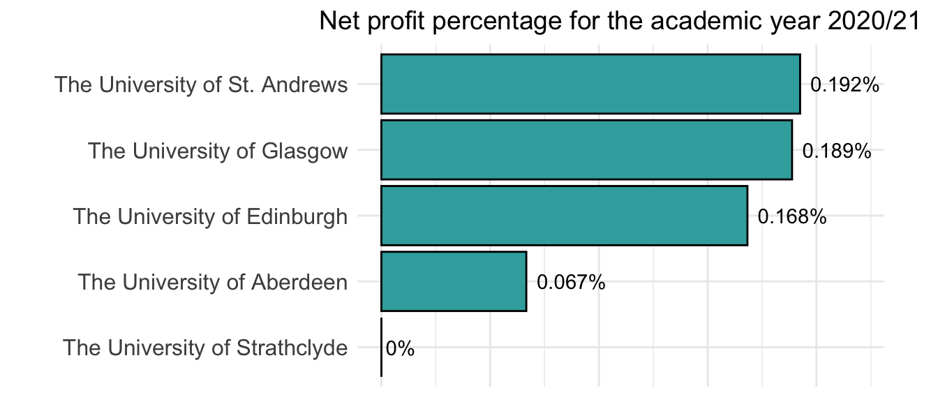
Visualising this, and also ordering the results:

-
See the BUFDG’s “Understanding University Finance”, p.41. A deficit, though, clearly can be a bad thing if large: https://www.theguardian.com/education/2022/nov/13/dismay-at-threat-of-devastating-job-cuts-at-birkbeck-university-of-london. ↩︎
-
See “Understanding University Finance”, p.41. ↩︎
-
These values can also be confirmed via the interactive HESA table here: https://www.hesa.ac.uk/data-and-analysis/finances/table-1. ↩︎