In this follow up Python post, I document experiments with OpenAI’s text-davinci-003 and GPT-3.5-turbo endpoints, including an unexpected model response to a small prompt change.
Using the OpenAI API
Following on from the Part 1, where I explained how I accessed an IMDb dataset for sentiment analysis, as well as the OpenAI API, I now document some experiments with Python.
The format of this blog is as follows:
- First, I return to the
temperaturesetting for the OpenAI models under consideration, which was set aside in Part 1 (beyond mentioning that this needs to be exlicitly set to zero for tasks like sentiment analysis). I show here what happens if this is not done. - Second, I experiment with “strengthening” a main prompt used for sentiment analysis, and document some unexpected (and downright weird) results with
text-davinci-003 - Finally, I experiment with adding the terms “neutral” and “borderline” borderline as additional, third, labels for the models to predict
Temperature
Now, temperature. A proper discussion of what the “temperature” parameter is, and how it works, would take us into the realm of probability and the maths of inference from LLMs. An interesting topic for sure, but one which would (I confess) require some serious reading on my part to do it any justice. A short, sweet, and simplistic description (let’s call it “intuitive”) is just to say that the temperature setting controls the randomness (or “creativity”), within certain predictable parameters (i.e. a range of responses that a model could give), of a response. The setting can range from 0 to 2, with 0 the most deterministic and 2 the most random (or “creative”).1 The default value for both of these endpoints is 1. 2
If, like me, you have a tendency to dive in and do stuff with code before fully “reading the instructions”, and you forget to set temperature for these OpenAI models, you end up with the default value and an element of randomness in the outputs. This is illustrated here, which shows the results of three trials across 20 IMDb reviews:
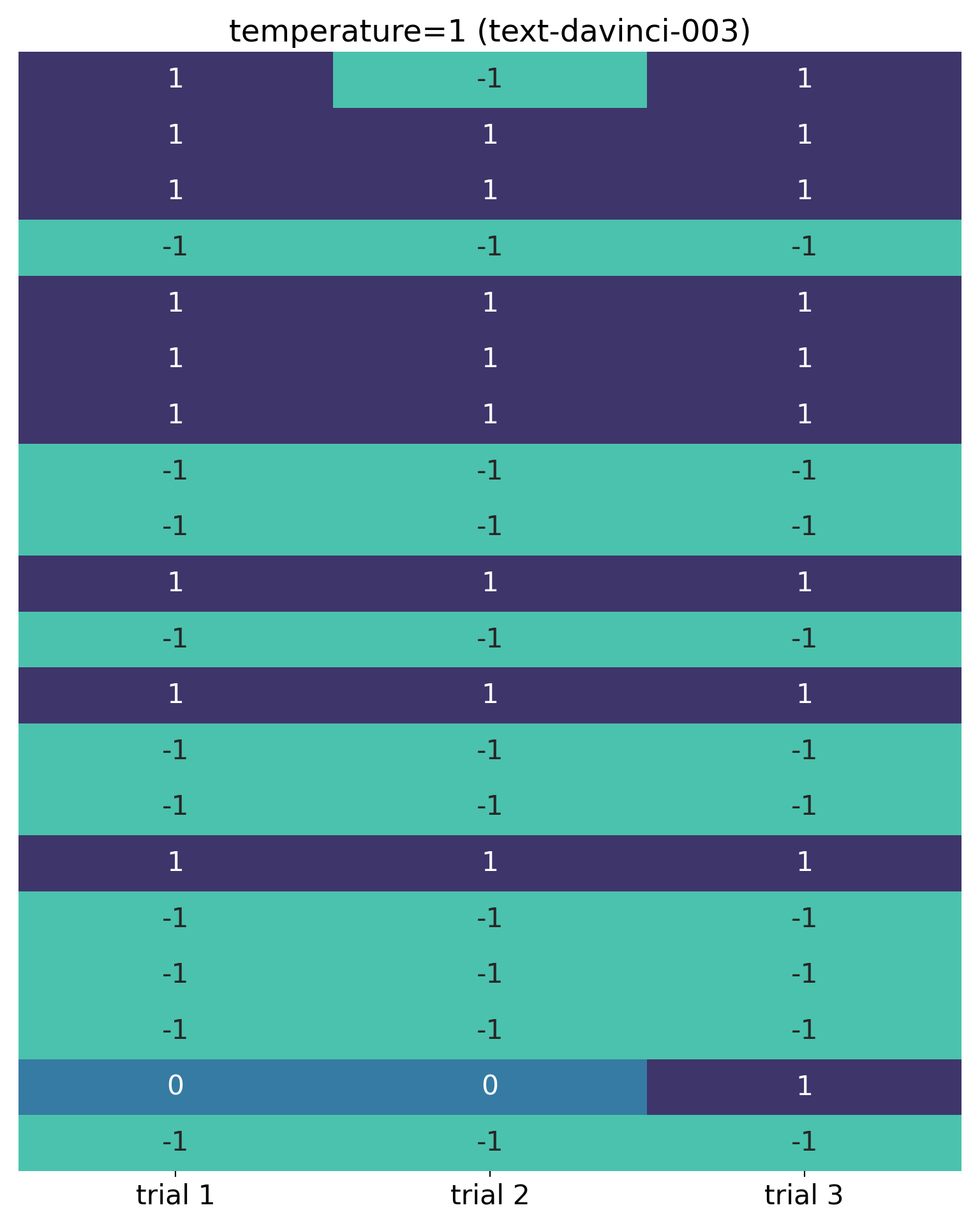
In this visualisation, each row represents the sentiment classification for a movie review, with different columns representing different trials across 20 reviews. It was necessary to convert the labels (“negative”, “neutral” and “positive”) into numeric values (I chose -1, 0 and 1 respectively).
It’s obvious from this that there is a lack of consistency: in the second trial, the sentiment classification of the first review was flipped from “positive” to “negative”; additionally, the penultimate review was classified as “neutral” in trials 1 and 2 – something that was not asked for. The code that produced this (temperature unspecified, and therefore equal to 1), was:
classify_sentimentDavinci(prompt = "Classify the sentiment of the following review as `negative` or `positive`")
No “neutral” in sight! I’ll return to this issue shortly, in the next section.
I’m using the seaborn library’s heatmap function here, and the “mako” colour palette which is easy on the eye and good for accessibility (it’s designed to be colour blind-friendly).3 The full code for this function is in the Appendix, and in this case the visualisation was created with this code:
compare_labels(df1, df2, df3,
               labels=["trial 1", "trial 2", "trial 3"],
               title="temperature=1 (text-davinci-003)")
Here I’m passing the output from three trials, stored in DataFrames df1, df2 and df3, to the function and specifying labels and a title. The respective calls were sent to the API within a 1 minute period. For the purposes of this blog I’ve loaded these results with pd.read_csv() file in the background, rather than store my API key on GitHub, as a security measure.4 I’ll hide the compare_labels code from now on, for neatness.
I’m sure this visualisation isn’t original, and I may have seen it somewhere before in this context, but I was looking for something like a Southern blot, a technique in molecular biology where strips are laid side by side, vertically, and one can read across to see whether bands are present at the same level in all strips. With a Southern blot, the different levels relate to specific DNA fragments, and one can gauge the quantity of a particular fragment in different strips by the intensity of the staining (following a process called gel electrophoresis). Here we are doing something much simpler: just checking to see whether there is consistency in the sentiment score for a particular movie review.
Finally, explicitly setting temperature to 0 gives consistent results across trials (again, these calls were made within a 1 minute period):
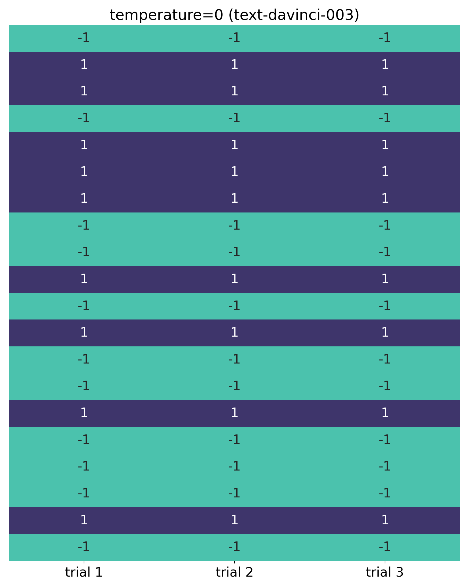
Needless to say, I explicitly set temperature to 0 for the tests below (and my code in the Appendix also has this setting).
“either”!
Due to the appearance of “neutral” classifications above, I decided to make the prompt slightly more emphatic.5 So, I introduced the word “either” to stress that I was looking for a binary classification only, and edited the prompt from this:
- “Classify the sentiment of the following review as
negativeorpositive”
to this:
- “Classify the sentiment of the following review as either
negativeorpositive”
Here are the results for the first 20 IMDb reviews:
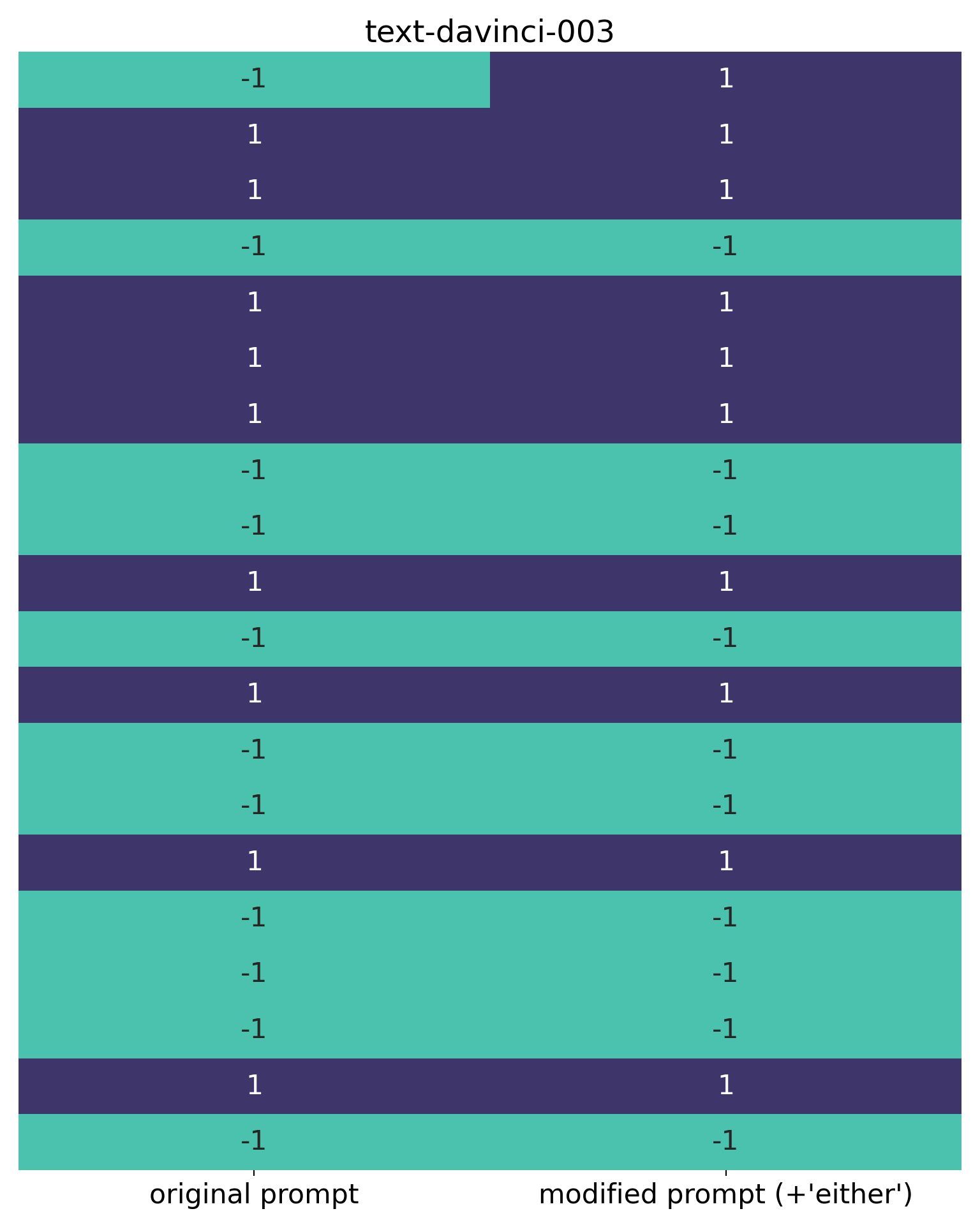
Wow. The sentiment score for the first review reversed from “negative” to “positive”. I found this to be reproducible over many trials, and appears to be entirely attributable to the addition of the word “either” to the prompt. I invite you to try this yourself, if you’re in doubt (and if you don’t see this result with text-davinci-003, please let me know and I’ll check my code again – the model isn’t being updated any more, so I wouldn’t expect this behaviour to change).
Why is this happening? I have no idea! Somehow the presence of the word “either”, which for humans would probably be inferred from the original prompt, is influencing the sentiment classification. Suddenly we’re into the peculiar world of LLMs as “black-boxes”, and behaviour that can be difficult if not impossible to explain.
Let’s take a closer look at that review, though. Here’s the review in question (accessible via imdb["train"]["review"][0]):
“One of the other reviewers has mentioned that after watching just 1 Oz episode you’ll be hooked. They are right, as this is exactly what happened with me.
The first thing that struck me about Oz was its brutality and unflinching scenes of violence, which set in right from the word GO. Trust me, this is not a show for the faint hearted or timid. This show pulls no punches with regards to drugs, sex or violence. Its is hardcore, in the classic use of the word.
It is called OZ as that is the nickname given to the Oswald Maximum Security State Penitentary. It focuses mainly on Emerald City, an experimental section of the prison where all the cells have glass fronts and face inwards, so privacy is not high on the agenda. Em City is home to many..Aryans, Muslims, gangstas, Latinos, Christians, Italians, Irish and more….so scuffles, death stares, dodgy dealings and shady agreements are never far away.
I would say the main appeal of the show is due to the fact that it goes where other shows wouldn’t dare. Forget pretty pictures painted for mainstream audiences, forget charm, forget romance…OZ doesn’t mess around. The first episode I ever saw struck me as so nasty it was surreal, I couldn’t say I was ready for it, but as I watched more, I developed a taste for Oz, and got accustomed to the high levels of graphic violence. Not just violence, but injustice (crooked guards who’ll be sold out for a nickel, inmates who’ll kill on order and get away with it, well mannered, middle class inmates being turned into prison bitches due to their lack of street skills or prison experience) Watching Oz, you may become comfortable with what is uncomfortable viewing….thats if you can get in touch with your darker side.”
I’ve not seen Oz and, to be honest, am not sure I want to see it after reading this review. From a sentiment analysis perspective, though, it’s easy to see why this review could cause problems for a model. It’s quite strongly and even forcefully worded, with a mix of positive and negative sentiments, and classification could potentially go either way.6 In my view, it’s a positive review overall, although it might also serve as a trigger warning for some readers.7
The fact that this review might be difficult for a model to classify, however, doesn’t explain why adding “either” to the original prompt reversed its sentiment classification. Maybe “borderline” reviews are more easily influenced by small changes to prompts, but the change here was to make explicit something that would probably have been inferred – by a human, at least – from the original prompt. So, “black box” territory and still very weird. The mystery remains!
GPT-3.5-turbo, in contrast, rated this review identically with both prompts (i.e. the original prompt, and the prompt with “either” added)":
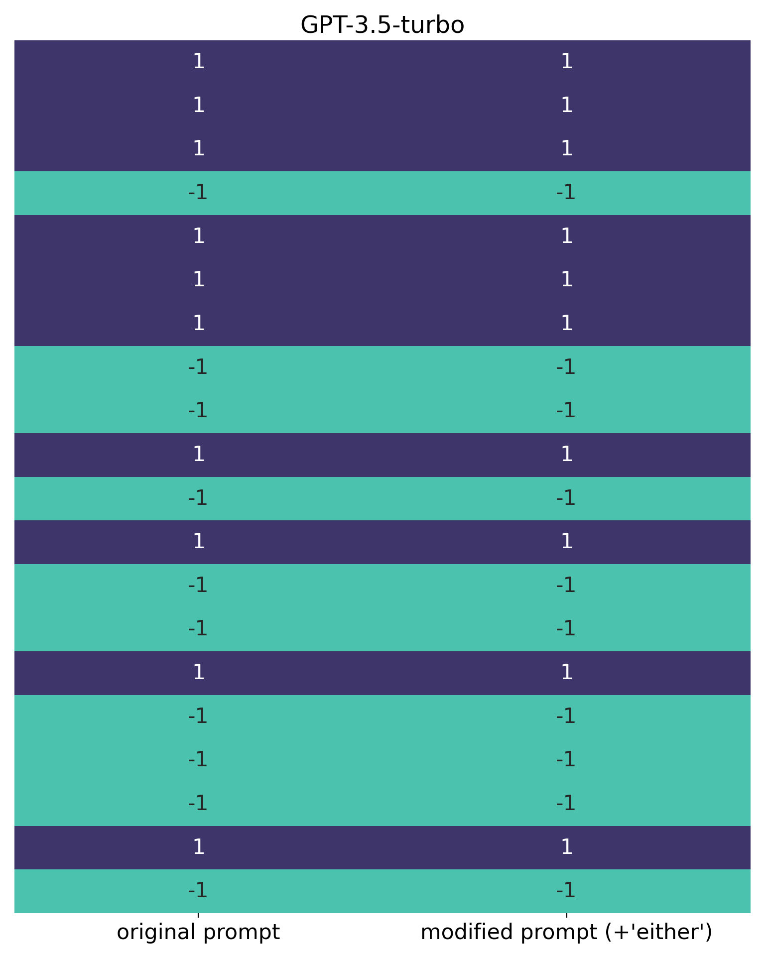
So here we see a notable difference between the two models. GPT-3.5-turbo also agrees with my own assessment of this review i.e. that it’s positive.
“neutral” v “borderline”
One way of dealing with reviews which are difficult to classify is to introduce “neutral” or “borderline” categories, rather than try to force the model to choose between “negative” and “positive”. Additionally, if it’s important for business or research reasons to get reviews “right”, a label like “borderline” could also be used to trigger a human review.
A couple of final prompts I tried were:
- “Classify the sentiment of the following review as one of the these three categories:
negative,positiveorneutral” ; and - “Classify the sentiment of the following review as one of the these three categories:
negative,positiveorborderline”
Here are the results from test using these, for the initial 20 reviews, with classify_sentimentDavinci():
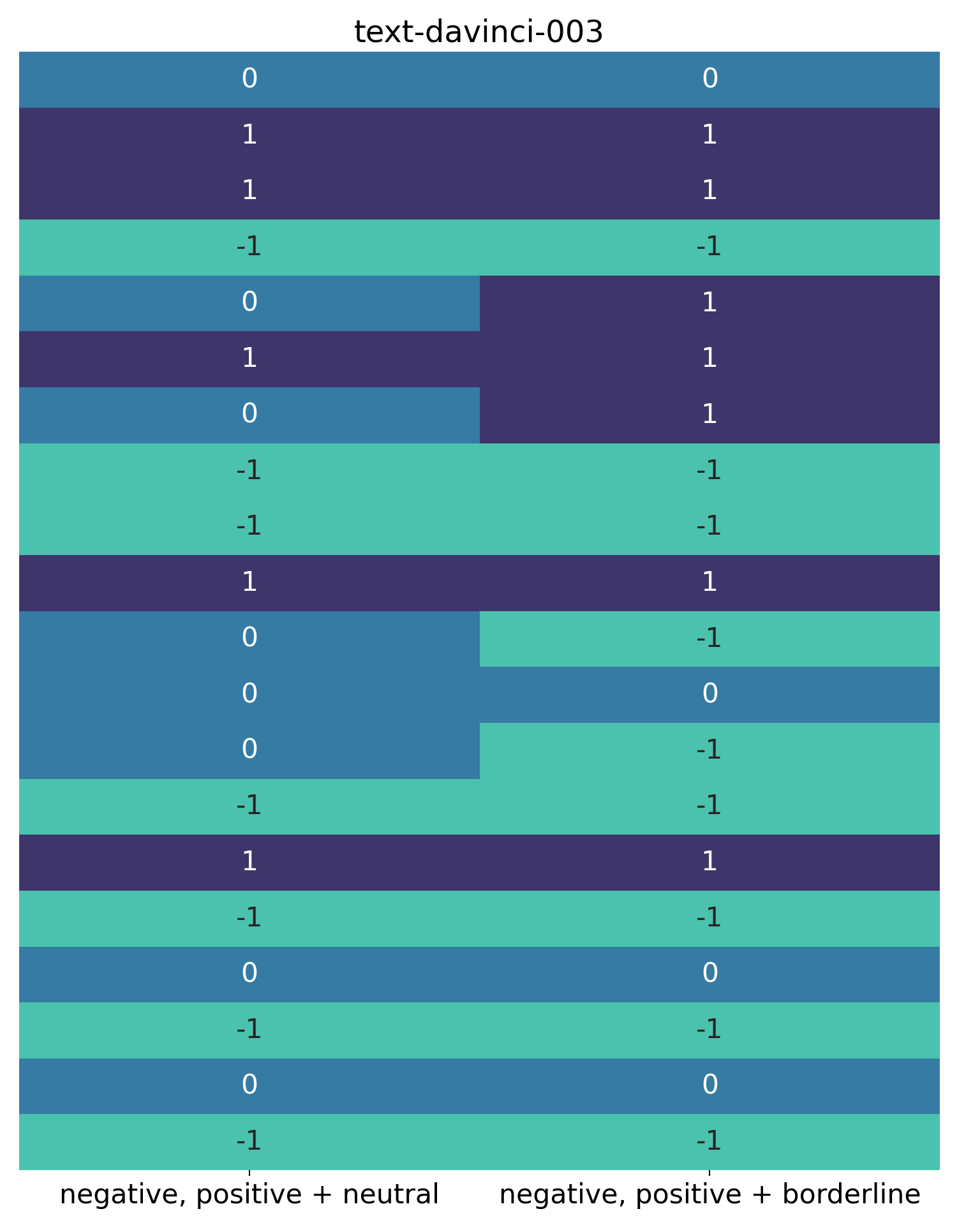
For this visualisation, I’ve used the same blue colour on the left to signify “neutral” reviews, and on the right to signify “borderline” reviews.
One observation is that the difficult “Oz” review has been classified as both “neutral” and “borderline”. This fits with the hypothesis that this is a difficult review for the model to classify, discussed earlier.
It’s also clear, though, that the words “neutral” and “borderline” are processed differently by the model. In this very small sample, more reviews were classified as “neutral” than “borderline”.
Let’s now compare this with the results from GPT-3.5-turbo on the same prompts. Providing these prompts to classify_sentimentTurbo() gave these results:
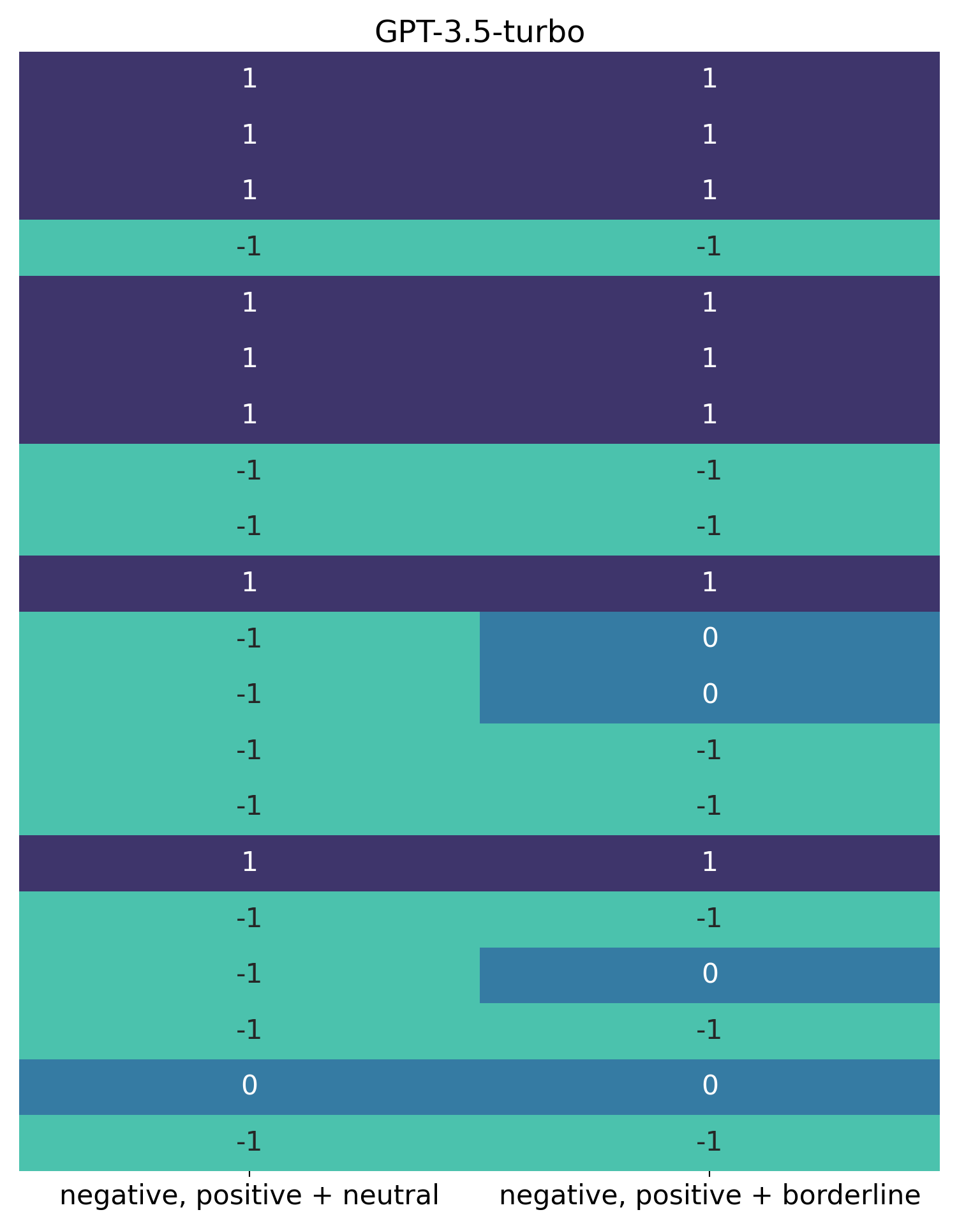
Again, blue on the left indicates “neutral”, and on the right indicates “borderline”.
This shows completely different behaviour to text-davinci-003. With GPT-3.5-turbo, on this small sample, there is only one “neutral” review. The difficult “Oz” review we discussed earlier is classified as neither “neutral” nor “borderline”. Additionally, “borderline” reviews are more common than “neutral” ones. Fairly substantial differences!
Appendix - Heatmap visualisation
Here is the code I used for the above visualisations:
import seaborn as sns
import pandas as pd
import matplotlib.pyplot as plt

def compare_labels(*args, labels=None, title=""):
    data = {}

    # Loop through each data frame and extract the 'Sentiment' column
    for i, trial in enumerate(args, 1):
        sentiment_list = trial['Sentiment'].to_list()

        # Use custom labels if provided, otherwise default to "df_1", "df_2", etc.
        label = labels[i-1] if labels else f'df_{i}'

	    # Create a dictionary of lists, where the key for each list is the label
        data[label] = sentiment_list

    # Convert the dictionary to a DataFrame
    df = pd.DataFrame(data)

    # Convert string labels to numerical codes
    label_to_num = {'positive': 1, 'negative': -1, 'neutral': 0, 'borderline': 0}
    df.replace(label_to_num, inplace=True)

    # Get specific colours from the "mako" palette
    mako = plt.colormaps.get_cmap('mako')
    colour1 = mako(0.75)
    colour2 = mako(0.5)
    colour3 = mako(0.25)

    # Create the heatmap
    plt.figure(figsize=(8, 10))
    sns.heatmap(df, annot=True, fmt='d', cmap=[colour1, colour2, colour3], cbar=False,
                xticklabels=df.columns, yticklabels=False,
                annot_kws={"size": 16})

    # Increase the size of the x-axis labels
    plt.xticks(fontsize=16)

    # Add a title at the top
    plt.title(title, fontsize=18)

    # Remove white space around the figure
    plt.tight_layout()

    plt.show()
Explanation
This requires a slightly more detailed explanation than the one I provided for the functions in Part 1.
Arguments:
- The function is intended to be flexible (
*args), and 1 or more DataFrames can be passed. In the blog above I passed either 2 or 3 DataFrames - There are two optional arguments:
labelswhich expects a list of labels, andtitlewhich expects a title as a string.
Initial part:
- An empty dictionary,
data, is created. - Then there is a loop:
- The
enumerate()function, within a loop, is used to iterate over however many DataFrames have been passed tocompare_labels; the variableikeeps track of the iteration-number (meaning that it’s not necessary to specifically create, and increment, acountvariable to do this), and thetrialvariable stores the passed DataFrame for each iteration label = labels[i-1] if labels else f'df_{i}'is a concise way of writing an if-else statement. The goal here is to use any labels that have been passed tocompare_labels, and if none have been passed (else) instead name themdf_1,df_2etc. The expressionf'df_{i}'uses f-strings to ensure that the number indf_1etc is converted to a string (an alternative would belabel = 'df_' + str(i))- the loop then creates a dictionary of lists, populating the
datadictionary created earlier: with each iteration, and new list of sentiment classifications is added, in each case with thelabeladded as the key
- The
- After this loop, the dictionary of lists is converted to a DataFrame,
df, with the pandasDataFrame() - The rest of the function is all about the visualisation, with
dfpassed to theseabornlibrary’sheatmapfunction. Theseabornlibrary builds on top ofmatplotlib, which is why it was necessary toimport matplotlib.pyplot as pltearlier.
Visualisation-related part:
sns.heatmapneeds to see numeric data, so the labelspositive,negativeetc are converted into intuitively sensible integers. I decided not to overcomplicate things and gave bothneutralandborderlinevalues of0, as it seemed easy enough to interpret the visualisation.8- I extract some colours to use from the “mako” palette (this is effectively a spectrum, and floats between 0 and 1 select colours within this spectrum)
- The canvas size is set as 8 x 10 , fairly pragmatic but seemed to work fine in the context of the blog
- the actual
sns.heatmap()call:- passes the previously created DataFrame
df, - specifies that the integers are shown (
annot=True) as integers (fmt='d'), - and applies the colourmap
cmap. I basically experimented to ensure the colours matched the values, intuitively, but there is clearly a deeper logic under the hood (which I’ve not delved into). - a colour bar seemed unhelpful, so this has been disabled
cbar=False, as have the y-labels (yticklabels=False), and the x-labels are set to match the titles of the columns fromdf(xticklabels=df.columns).annot_kws={"size": 16}sets the size of the integers shown
- passes the previously created DataFrame
- the final parts, as may be fairly obvious, just set the font size for xticks, and the title (if present), and get rid of white space around the figure (
plt.tight_layout()) before showing the visualisationplt.show()
-
A slightly more detailed (but still hand-wavy) explanation is that temperature affects the probability distribution of the softmax function used to convert logits, the raw outputs from LLMs like
gpt-3.5-turbo, into probabilities. Essentially, a lower temperature setting makes the model more deterministic, with the model always selecting the most probable next token as an output, while a higher temperature allows for more randomness. The use of the softmax function for models like this was introduced in the seminal 2017 “transformers” paper, “Attention Is All You Need”, by Ashish Vaswani and colleagues. ↩︎ -
See here for
text-davinci-003and here forgpt-3.5-turbo. ↩︎ -
More information on the seaborn colour palettes, including “mako”, can be found here. ↩︎
-
This is consistent with OpenAI’s Best Practice guidance. ↩︎
-
In hindsight, if I hadn’t forgotten to set
temperatureinitially I may not have experimented with making the prompt stronger at all, and thus may not have discovered this curious behaviour of the model. A possible benefit, I’d like to think, of diving in before properly “reading the instructions” here. ↩︎ -
The review contains lots of what philosophers might call thick value terms. Unlike “good” or “bad”, which are more purely evaluative, terms like “dodgy”, “shady”, “comfortable” and “uncomfortable” have descriptive as well as evaluative content. It’s difficult to tell where descriptive ends and evaluative begins, and meaning can be influenced a lot by context. ↩︎
-
Or a trigger by itself, given the author’s use of racial and other categories which may cause offence (and which hopefully hasn’t been caused to any readers of this blog – apologies if this is the case). I include the review out of scientific curiosity, but am mindful of wider potential discussions (e.g. in ethics) which I’d prefer to sidestep given the focus of these posts. ↩︎
-
Strictly speaking, we might think of “borderline” as
NaN(not a number) because the model is unsure what the classification should be (possibly, anyway – as noted, we’re dealing with “black boxes” here and I’m not sure how these models are processing the word “borderline”). ↩︎